
How to Make Sense of Reduction Linocut
The first time I carved a reduction linocut was a revelation.

It was also the first time I printed a linocut from a Vandercook letterpress, so the revelations multiplied over one another to create a printmaking experience that has shaped my artistic practice ever since. Yeah. I love it.
What is Reduction Linocut? (what other kinds of linocut are there?)
Reduction linocut is a technique for achieving multiple colours in a single print while only using one block. You carve one layer, print it across your edition, carve some more, print again on the same pages, and repeat as needed.
There are essentially 3 kinds of linocut. We have:
- Single layer linocut - You carve, you print, you're done. You get two colours: paper and ink.

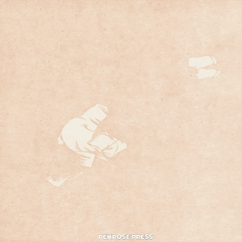
"Nymue" Brianna Tosswill
2. Reduction linocut - You carve, you print, you carve, you print... you're done. You get as many colours as you want but as a general rule your consecutive ink colours must be darker or less saturated than the layer previous.

"It's a book" Brianna Tosswill
3. Multi block linocut - You carve more than one block to line up with each other during printing. You can print them in any order. You get a truly unlimited number of colours but good luck keeping them straight! (Check out How to Draw for Linocut Printmaking where I explain that with 10 separate blocks you can acheive more than a thousand colours!)

"Where we lay, we have everything we need" Brianna Tosswill
If you want to split hairs, selective inking may be its own category but it's still strange and elusive to me. See the work of Laura Boswell and Anya Barabanova if you want to try to make sense of it for yourself.
One more disclaimer: while reduction linocuts are truly the best, please start with at least one single-layer print before you dive in head first. Okay? Okay.
Why Reduction Linocut is Totally Awesome:
- You achieve at least 3 colours (2 inks plus paper) and you only have to register the layers during printing, not during drawing and carving since it's all on one block.
- It's FAST. I often turn out a reduction linocut in one or two studio days depending on edition and block size. (This has a lot to do with using a self-inking letterpress) You also save time by only having to clear areas once as compared to a multi-block linocut. (This also saves your wrists and elbows)
- You get an automatically cohesive colour palette.
- You consume less material than multi-block printmaking for a similar finished look.
- Did I mention registration?
A case study: Unconscious Movement
I just finished this print featuring my smart, powerful, beautiful friend Sanaa. I wanted to capture the feeling of one of those sunny winter days where you're free to read for hours and time is measured by changing your position around the book. While I was working on it I knew I would be writing this blog post so I took lots of detailed photos and notes of the process. (I'm usually going by intuition so it was interesting to break it down like this) I'll be taking you through it layer by layer to explain what I was thinking and planning, how things actually went, how I trouble-shooted (trouble-shot?), and how I achieved the colour of each zone of the print.
I always start with a line drawing and a rough idea of a colour palette. If you need shading to sketch in your drawing it's going to be more difficult to translate. Also, we're working in Sharpie and you can't shade in Sharpie. Sometimes I put little hatching marks to indicate a middle tone, see under the chin of the figure lying down?


A note on the colour palette: The first three layers are to establish a skin tone. I go into detail about my colour strategy in How to Draw for Linocut Printmaking, essentially it's about how local colour isn't that important. This is where I break my own rules. I think that for a print based in realism, as this one is, then skin tone is important to render in a life-like palette. After those first three colours, my options open way up. I often improvise slightly during that phase of the linocut according to what looks good on the paper (as opposed to inside my head or on a screen). I adhered pretty closely to the plan, although simultaneous contrast makes certain colours difficult to discern. More on this below.
Why are we working in Sharpie? This brand-name permanent marker is the tried and true tool of many linocut artists including myself. However, it behaves differently on porous "battleship" linoleum than on the vinyl-like surface Ive been purchasing by the foot through my studio. If you've been doing some trial and error on your own, you may have noticed that the marker sometimes transfers during printing, and not just on your first print. That Sharpie residue can linger through your first twenty prints, and lots of printmakers only do editions of ten or twenty.
On the battleship linoleum I make my drawing in Sharpie, leave it at least a day (you can be carving during that time), then clean it off with a solvent. I've used both mineral spirits and blanket wash. The residue that transfers when you print comes off, AND (here's the magic) your lines stay faintly in place from the staining properties of this marker. I thought it was all fine-liners but it is only Sharpie in my experience. Those faded lines will stay on your block through a decent amount of carving and printing. Keep an eye on them as you make your way through this process and reinforce them as needed.
On the vinyl-like lino I used for this print, if you use solvent to remove the marker, it comes of completely: no helpful staining. My strategy is to leave it be, and ignore the transferrence in the early layers of my project. In the final layers, I usually have enough carved that I dont need my linework any longer and I clean it off. The last two layers, as transparent as I'm printing, are still enough to cover any lingering sharpie marks on the prints.
[Edit from 2024 Brianna: For the last few years I have been preserving my drawing between layers by inscribing the lines VERY faintly when I'm carving the first layer. I use my smallest v-gauge and press only hard enough to scratch the surface. The lines are so faint that they mostly don't show up during printing, but (especially when stained with ink) they do show up on the block, giving me just enough of a guide to know what I'm doing.]
Layer 1
Okay, first off, I love how you can see every little thing in these scans, and depnding on how you're reading this (laptop, phone, tablet) they might be close to actual size: 8 x 8". The face you can see most clearly is about the size of my thumb.
In the first layer I tried to establish the difference between the lightest area of skintone, and bright white. There are two figures overlapping, and I decided sort of arbitrarily that the lying down figure would be opaque, and the sitting figure would be translucent but in-front. So the shirt and socks that are white on the lying down figure, are muted lights in the sitting figure and dont make it into the first carve. The book held by the sitting character is also translucent so it's only white where it overlaps with the white shirt behind it.
I have to constantly check in with myself about the logic I am creating. Writing it down in words doesn't always work for me, and sketching with markers is only partly effective. I mostly have to hold tightly to the vision in my head and hope everything works out.

Layer 2
In the second layer, the colour is again determined by Sanaa's skin and the slightly warmer tone of her forehead compared to the paler pink of her cheek. I agonized over that line of separation. It looked so stark when this was all that was on the page. I had to keep reminding myself that my eyes are playing tricks and the contrast I saw at this point was not representative of the final image.
I decided to render the carpet slightly skewed at this point (a spontaneous choice) and sharpied over a whole other design that I had planned but was looking too busy. You can see the effect that has on the print by finding the subtle edge of the figures. They're slightly lighter and more saturated compared to the barely darker, grayer background.
I brought in a few details here on the hands and carved the tattoo on the lying down figure. I also added a bit of translucent pink thigh overlapping with white shirt. The opaque figure is wearing red pants, so when they overlap a white shirt... I tried to follow this logic all the way around but I ended up with white and dark yellow overlapping to make pale purple which--they don't. I'm a bit nervous that I'm asking you to look THIS closely at my art, haha.

Layer 3
The third layer is my favourite for showing subtleties of skin tone. You can still see the difference between cheek and forehead but the definition around the eye and mouth make it look right. You can see the palm is paler that the forearm of the sitting figure, and the lines on that palm are subtle. I meant for this layer to be purple and I've been looking at it for hours, still can't decide if it's purple or brown or gray. My mom and I used to really disagree about this one pair of green pants I had that she thought were blue (see my bias). Ever since then I have been convinced that people see colours differently which is amazing.
I probably should have carved the remainder of the book page and the sock of sitting figure but--I forgot to.
Also the carpet pattern is going in more or less randomly but I am consciously creating the "aesthetic random" where you keep things from being too perfectly mixed, and create little clusters. You can google that but I have no idea if it's a thing. The quotation marks are a dubious glance at my own brain.

Layer 4
I finally remembered the edge of the book and the top of the seated figure's shoulder with layer four but I am still missing that sock. Also, look how this saturated colour washes out all the previous layers, pushing them together! This is the constant battle of reduction linocut: HOW MUCH CONTRAST BETWEEN EACH LAYER? I am still figuring this out after years of practice. I always have to remind myself to make my lightest layers a bit darker, a bit more contrasty, reminding myself that the darker layers will push them together. This should probably be your number one takeaway.
This is the last real layer of skintone.

Layer 5
I was going for green with layer five and objectively, I don't think it makes it. Subjectively, between the red and the next layer which goes a bit warmer, it works. (Youre like: Brianna... this is brown? What are you talking about?) Just wait and see!
So I told you the pants would be red, and so are the book covers. I think it's important to make certain elements of the figure (or foreground) in mid-to-dark tones so that she doesn't look like she's floating on top of the background, but part of the same scene as it.
Maybe take a minute to look at the edges and outlines. They're being carved away bit by bit. The outline on the shirt, socks, sitting shoulder, book, are all in the colour one layer darker than the main local colour of those objects. This is to fight that key-layer flattening that I was pointing out in the last layer. With outlines in varying colours, and not all in the final brown, we see more subtlety and softness.

Layer 6
I told you the second last colour was kind of green! To be clear, the leaves and stems have been carved away, not carved around. Don't fight the lino if you can work with it. That leaf shape is SO EASY to carve with a large v-gouge.
I left Sanaa's tattoos in green although I'm pretty sure they're black in real life. I pretty much avoid black completely in my art. Her hair also has a few subtle green highlights at the end which are brown in my reference photo but were definitely green at some point or I'm going crazy. Anyways, creative liberty!
I couldn't figure out how to render the seated figure's knee in keeping with the rest of the print's logic but I think it kind of works the way it ended up.
You can barely see the difference between cheek and forehead, palm and forearm anymore, but they are there oh-so-subtly. Here's a thing with linocut: If you can't see the difference between two different layers, what was the point of printing them separately!? I'm always watching myself for ineffective labour. I may as well direct my efforts into beautiful things that are visible.

So there you have it.
This lesson is brought to you today by my prints shop! If you found it helpful, educational or just plain cool, have a look and consider supporting this independent artist! You will earn my eternal gratitude.

10% of the proceeds from every sale in the edition of "Unconscious Movement" go to Making Space, a visual-arts focused peer mentorship group that decenters whiteness. It is co-run by Sanaa Humayun (featured in the linocut) and Kiona Ligvoet. These artists/students/community organizers are putting together an online community, hosting regular speakers, and they have an open call for bipoc emerging arts facilitators to lead short workshops! Definitely go have a look at what they're working on, either to take part in the community, or do some learning.
4 comments
Hi Eden, I tried to reply to you via email but it bounced! I hope this finds you!
For inks, I’m using either oil-based or rubber-based. Anything water-based like acrylic I find that the working time is way too short. So I never have to include extender, and sometimes I actually add dryer. These inks are naturally transparent, and I apply them in REALLY thin layers which is hard to do without a self-inking letterpress, but you could achieve something similar with transparent base and a brayer (or a roller bigger than your block). My prints are often not fully drying between layers, but because the ink is so thin (literally, very little ink), it’s fine. When I get into later layers, and the ink has accumulated more on the paper, I do need to let it dry to achieve better results (hence adding drier).
As for my newest prints, they are all reduction. I’m just being tricky with pressure printing and selective inking, which has allowed more colours of ink to show through, and given the impression of multiple blocks. (Like, Crushing Softly is only 4 layers of reduction but it looks like an 8 layer multi-block) I’ve thought about doing a blog post about pressure printing, but it’s a kind of tricky how-to because I don’t know if it would work very well with an etching press, and probably not at all if you’re printing by hand, so it’s pretty niche.
I hope this helps, and good luck with your linocut experiments!
Brianna
Hi there! I am going through all your blog posts and learning so much. Your wealth of knowledge is incredible and genuinely so helpful. I am wondering about inks, if you’re open to sharing what you use in reduction printing. I’ve mostly worked with acrylic speedball brand but open to changing it up. (One day making my own inks would be the goal). I’m wondering if you’re using an extender or transparency base in some of your prints. I can’t remember if I read it here to look for that. Also wondering if you are using oil, and only need 2 studio days- if the print is fully drying in between layers. I’m also using the green vinyl at the moment. Last question-if your newer prints are still only reduction? ❤️ Thank you so so so much!
Hi Kate, That’s a good question! I don’t think that using vegetable oil to clean your block will have any affect on sharpie staining, provided you’re using the porous hessian-backed lino. The chemistry desn’t line up. That said, can you do a little test on a corner of your lino to double check? That’s what I would do.
This was incredibly useful, as I start linocut again for the first time in 10 years! I’ve done single-layers and want to get back to reduction prints, preserving my drawing and my budget/single block as best as I can. I usually clean my blocks with vegetable oil (printing with oil based ink); do you know if that would affect the advice on sharpie staining?